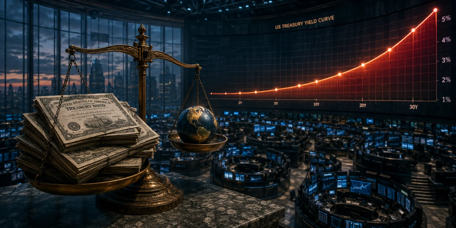
Dot-Com 2000 vs AI 2026: The Chart Every Investor Is Arguing About
Dot-com 2000 vs AI 2026, compared on the numbers: Shiller CAPE 41.93 against 44.19, forward P/E 20.0 against 24.4, and the capex chart nobody argues about.

One picture, two arguments, no agreement#
Every boom eventually gets its own chart. The AI boom has several, and the most shared version lays the Nasdaq of the late 1990s over the Nasdaq of the past three years, rebased so both lines start at the same point. Move the starting date by a year and the picture flips. Either the market is halfway up the slope that ended badly last time, or it has barely begun climbing.
That is the trouble with it. The chart is doing an argument's work, and its answer depends on the start date, the index chosen and whether the vertical axis measures prices or earnings.
Set the pictures aside and line up the numbers instead. Parts of the comparison survive that treatment. Parts do not. And the chart that turns out to matter most is not about share prices at all.
What these charts are actually measuring#
Three measurements do most of the arguing, and people swap between them as though they were interchangeable.
The cyclically adjusted price-to-earnings ratio, or CAPE, compares share prices with average inflation-adjusted company earnings over the previous ten years. Averaging across a decade stops one freak year from flattering or damning the whole market. It is the closest thing investors have to a long-run thermometer.
The forward price-to-earnings ratio compares today's price with what analysts expect companies to earn over the next twelve months. More current than CAPE, and more fragile, because forecasts can be wrong.
Capital expenditure, or capex, is money spent building long-lived physical things: data centres, chips, substations, cooling plant. Capex charts measure what is being built rather than what people pay for shares. They get ignored in bubble arguments, which is a shame, because they were the better guide last time round.
One more term matters. The equity risk premium is the extra return investors demand for holding shares rather than government bonds. A low premium means little compensation for risk.
Where 2026 genuinely rhymes with 2000#
The bears have their best evidence on the long-run valuation measure. The Shiller CAPE ratio for the S&P 500 stood at 41.93 on 2 September 2026. Its highest monthly reading on record was 44.19 in December 1999, and it was 43.22 in March 2000, the month the Nasdaq peaked (Shiller data via Multpl). On that measure US shares sit about 5% below the most expensive point in 145 years of records.
Concentration tells a similar story. The Bank of England's July 2026 Financial Stability Report found AI-related companies making up roughly half the S&P 500's market value as of 25 June 2026, against about a quarter at the end of 2022. The International Monetary Fund's April 2026 Global Financial Stability Report recorded the Herfindahl-Hirschman Index, a standard measure of how much of an index sits in a few names, above its 95th historical percentile in two of six major equity markets.
Then there is the price being paid for risk. The Federal Reserve's May 2026 Financial Stability Report noted that its estimate of the equity risk premium "remained near a 20-year low" as of April 2026, with the forward price-to-earnings ratio well above its historical median. Investors are being paid less for equity risk than at almost any point since 2006.
And then the arithmetic. The IMF calculated that to justify prices before the June 2026 Middle East conflict, S&P 500 earnings per share would need to grow at close to 30% a year through 2027, with Nasdaq earnings at about 35%, both "substantially exceeding current analyst expectations".
Four institutions, independently describing a market priced close to perfection. That part of the comparison holds.
Where the comparison quietly falls apart#
The other half gets much less airtime.
Only 14% of American companies going public in 1999 were profitable, and the same share in 2000. Last year the figure was 24%. The average first-day price pop on a new listing was 71.2% in 1999 against 29.3% in 2025, and there were 476 flotations in 1999 against 90 last year (University of Florida, Jay Ritter's IPO statistics). The 2000 bubble was, to a striking degree, a market for companies that made no money, sold at prices that doubled on day one. This one is neither.
The broad market multiple is also less alarming than the CAPE reading implies. FactSet's Earnings Insight of 7 August 2026 put the S&P 500's forward twelve-month price-to-earnings ratio at 20.0, against a five-year average of 19.9 and a ten-year average of 19.0. The highest reading in FactSet's twenty-year series for that measure was 24.4, on 24 March 2000 (FactSet). Expensive now, then, but not what 2000 was. CAPE looks worse largely because it divides by ten years of past earnings, and that decade contains a pandemic.
The bellwether comparison has moved too. At its 2000 peak Cisco was the world's most valuable company at $555bn, and in April 2000 it traded at 27 times enterprise value to sales, more than two standard deviations above its own average, according to Morningstar. Nvidia closed at a $5.52tn market capitalisation on 3 September 2026 on a trailing price-to-earnings ratio of 28.9 and a forward ratio of 18.9 (Stock Analysis). It also booked $96.2bn of revenue in the quarter to 26 July 2026, up 106% on the year, in results filed with the SEC.
The monetary backdrop is inverted, too. The Federal Reserve had pushed its funds target to 6.5% by May 2000. On 3 September 2026 the upper limit of the target range was 3.75% (FRED). In 2000 the market broke against tightening money. Today's money is looser, which is a real difference, though not necessarily a reassuring one.
The chart nobody argues about, and probably should#
The picture that deserves the attention the price overlays get sits in a working paper.
The Bank for International Settlements, in working paper 1367, The AI investment race, plotted hyperscaler capital spending against the great investment manias of the past two centuries: the American canal boom of the 1830s, British railway mania in the 1840s, the roaring twenties and the dot-com build-out from 1995. Indexed to the start of each episode, the AI build-out "is on track to outgrow every previous episode only three years in". Hyperscaler capex is set to exceed $700bn in 2026 alone, with industry guidance pointing to $3tn to $4tn of cumulative AI capex between 2025 and 2030.
The BIS also put a number on something newer. Across hyperscalers, AI labs, chipmakers and specialist cloud providers, it identified roughly $46bn of circular equity investment sitting against about $879bn of multi-year purchase commitments. In plain terms, companies are taking stakes in customers who then commit to buying their products. That is not a fraud, but it does mean part of the reported demand is being financed by the seller.
Against all that, the wider economic footprint is smaller than the capex headlines suggest. Research from Epoch AI puts AI infrastructure at roughly 0.8% of US GDP in the first quarter of 2026, with all computing infrastructure at about 1.5%, up from a 2015 to 2022 average near 0.7%. The Federal Reserve Bank of St Louis calculated that through the first three quarters of 2025, AI-related investment accounted for 39% of total US GDP growth, against 28% in 2000. Proportionally larger, in an economy that is very much bigger.
| Measure | Dot-com peak (1999 to 2000) | AI boom (2026) |
|---|---|---|
| Shiller CAPE, S&P 500 | 44.19 (Dec 1999) | 41.93 (2 Sep 2026) |
| S&P 500 forward 12-month P/E | 24.4 (24 Mar 2000) | 20.0 (7 Aug 2026) |
| US IPOs that were profitable | 14% (1999), 14% (2000) | 24% (2025) |
| Average IPO first-day return | 71.2% (1999) | 29.3% (2025) |
| Leading bellwether | Cisco, $555bn, 27x EV/sales (Apr 2000) | Nvidia, $5.52tn, 28.9x trailing P/E |
| Fed funds target | 6.5% (May 2000) | 3.75% upper limit (3 Sep 2026) |
| Share of US GDP growth from the boom | 28% (2000) | 39% (first 3 quarters of 2025) |
| Build-out against prior manias | the previous record holder | larger than every predecessor by year three |
Sources: Multpl/Shiller, FactSet, Ritter, Morningstar, Stock Analysis, FRED, St Louis Fed, BIS.
What the 2000 chart cuts off#
Overlay charts stop at the crash. The years after it are where the practical lesson lives.
The Nasdaq Composite closed at 5,048.62 on 10 March 2000. It closed at 1,114.11 on 9 October 2002, a fall of 77.9% in 31 months. It did not close above the 2000 record until 23 April 2015, at 5,056.06, a wait of just over fifteen years (Fortune). For scale, the index closed at 26,217.83 on 2 September 2026 (FRED).
Two things follow from that. The technology was real, and investors who bought at the top still waited fifteen years to get their money back. Being right about the technology and being right about the price are separate problems.
There is also a detail that complicates the tidy "it is all one bubble" reading. The Bank of England found that once you strip out the top 30 AI-related stocks, the excess CAPE yield on US equities sits near its lowest level since 2007. Stretched valuations are not confined to the AI names, which argues against the idea that the rest of the market can simply sit this one out.
Key takeaways#
- On the long-run valuation measure, the comparison holds. CAPE at 41.93 in September 2026 is close to the December 1999 record of 44.19.
- On profitability, it does not. Twenty-four per cent of companies floating in 2025 were profitable against 14% in 2000, and the forward market multiple of 20.0 is barely above its own five-year average.
- The capital spending chart is the stronger warning. The BIS finds the AI build-out already outgrowing every mania back to the canals, with capex above $700bn in 2026.
- Some of the demand is circular. Roughly $46bn of cross-holdings sits against about $879bn of purchase commitments, so part of the revenue is funded by the sellers.
- The recovery matters as much as the crash. The Nasdaq took just over fifteen years to regain its 2000 closing high, which is precisely what a price overlay hides.
Frequently asked questions#
Is the AI boom a bubble?
No central bank has said so. The Bank of England, the IMF and the Federal Reserve all describe valuations as stretched and the risk of a sharp correction as material. That is a statement about vulnerability, not a forecast.
Which chart should I actually look at?
Rebased price overlays are the least informative, because the answer shifts with the start date. CAPE, the forward price-to-earnings ratio and capital spending measured against operating cash flow are all published, free, and harder to bend.
Why do CAPE and the forward P/E disagree so much?
CAPE divides by ten years of past earnings, which currently includes the pandemic slump. The forward ratio divides by next year's expected earnings. Both are defensible. They answer different questions.
When did the dot-com bubble burst?
The Nasdaq Composite peaked on 10 March 2000 at a close of 5,048.62 and reached its closing low of 1,114.11 on 9 October 2002, a fall of 77.9% in 31 months.
Would a repeat hit an ordinary index fund?
Yes. With AI-related companies at around half of S&P 500 market value, a broad US index is far less diversified than the word "index" suggests.
Are today's AI companies safer because they are profitable?
Profitability changes the failure mode rather than removing it. A profitable company can still be overpriced, and a growing share of the current build-out is debt-financed rather than paid for out of cash flow.
What would tell me the comparison is tipping the wrong way?
Watch capital spending rather than prices: capex rising while operating cash flow falls, and lenders beginning to price individual AI borrowers differently instead of treating them as one trade.
Is any of this investment advice?
No. This article describes published data and official assessments. Decisions about your own money should involve a regulated adviser who knows your circumstances.
Glossary#
CAPE (cyclically adjusted price-to-earnings) ratio Share prices divided by average inflation-adjusted earnings over the previous ten years, which smooths out the business cycle.
Forward price-to-earnings ratio Share price divided by expected earnings over the next twelve months. More current than CAPE, and dependent on forecasts.
Enterprise value to sales (EV/sales) A company's market value plus its debt, divided by its annual revenue. Useful for comparing firms whose profits swing about.
Equity risk premium The extra return investors expect from shares over government bonds. A low premium means little compensation for risk.
Capital expenditure (capex) Money spent on long-lived physical assets such as data centres, servers and power infrastructure.
Herfindahl-Hirschman Index (HHI) A concentration measure. Applied to a share index, a high reading means a few companies dominate its value.
Rebasing Resetting two data series to the same starting value so their shapes can be compared. The starting point chosen strongly affects the picture.
Hyperscaler A very large cloud computing operator running data centres at global scale, such as Amazon, Microsoft, Alphabet or Meta.
Circular financing An arrangement where a supplier invests in a customer that then commits to buying the supplier's products, so part of the reported demand is funded by the seller.
Basis point One hundredth of a percentage point.
References#
- Robert Shiller's cyclically adjusted price-to-earnings data, Shiller PE Ratio by Month, accessed 4 September 2026.
- Bank of England, Financial Stability Report, July 2026.
- International Monetary Fund, Global Financial Stability Report, April 2026, Chapter 1.
- Board of Governors of the Federal Reserve System, Financial Stability Report, May 2026: Asset Valuations. Data as of April 2026.
- Bank for International Settlements, The AI investment race, BIS Working Paper No 1367.
- Jay R. Ritter, University of Florida, Initial Public Offerings: Updated Statistics.
- FactSet, S&P 500 Earnings Season Update, 7 August 2026, and Highest Forward 12-Month P/E Ratio for S&P 500 Since 2002 for the March 2000 peak of 24.4.
- Morningstar, Nvidia Stock 2023 vs Cisco Stock 1999: Will History Repeat Itself?.
- Stock Analysis, NVIDIA (NVDA) Statistics and Valuation, accessed 3 September 2026.
- NVIDIA Corporation, second quarter fiscal 2027 results, filed with the US Securities and Exchange Commission.
- Federal Reserve Bank of St Louis, Federal Funds Target Range, Upper Limit (DFEDTARU) and NASDAQ Composite Index (NASDAQCOM).
- Federal Reserve Bank of St Louis, Tracking AI's Contribution to GDP Growth, January 2026.
- Epoch AI, Data center buildout share of US GDP.
- Fortune, Nasdaq surpasses internet-bubble peak to set new record, 23 April 2015.
- Board of Governors of the Federal Reserve System, Open Market Operations Archive, for the May 2000 federal funds target.